Dynamic Chiropractic is pleased to announce the winners of the 6th annual ChiroMaster awards contest. The ChiroMaster was created in 1998 to recognize the best Web sites of individual doctors of chiropractic.
This year's content included nearly 40 sites submitted for review. Each site was evaluated by a four-member Web site review panel and judged on a variety of criteria, including:
- the particulars of the doctor's practice (office hours, driving directions, types of services provided, etc.);
- information for patients on the value of chiropractic treatment;
- information on the art and science of chiropractic;
- technical considerations (download time, ability to navigate quickly and effectively, compatibility with commonly used browsing programs, etc.); and
- miscellaneous factors (working links, proper spelling and grammar, frequent updates, etc.).
Based on these criteria, the following sites have been designated the winners of this year's ChiroMaster Award:
Dandrea Chiropractic (www.dandreachiropractic.com)
 Arguably the best site in this year's contest, dandreachiropractic.com features a clean home page that makes good use of text and white space. The site is divided into seven sections (plus a link to the home page), with the top four relating to chiropractic, and the bottom three relating to Dr. Dandrea's practice. The text is presented in a clean, easy-to-read format, with a fair amount of information contained in each section. Among the site's highlights are its links section (under the title "Health Watch,") and "Testimonials," which includes patient histories and before-and-after X-rays of patients who received chiropractic care.
If there's a constructive criticism to be made about the site, it's that some of the sections contain relatively sparse information. For instance, the "About Us" section would be even better if it included a biography of the doctor and office staff, and the "Why Chiropractic?" section could be improved by elaborating on the conditions chiropractic can treat. Aside from these minor contrivances, dandreachiropractic.com is an excellent chiropractic Web site and a worthy recipient of the ChiroMaster Award.
Foster Family Chiropractic (www.fosterfamilychiropractic.com)
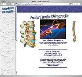
 Most reviewers frown on sites that have a "busy" home page, but in the case of fosterfamilychiropractic.com, it works. The animated files and scrolling message on the front page provide solid, chiropractic-related "eye candy" without being overly distracting. The site also makes use of Java features, such as rollover buttons on the left-hand toolbar, adding another nice visual touch.
The Foster Family Chiroprctic site contains three dozen sections, detailing nearly every aspect of the practice. In addition to the vast wealth of information the site contains, most sections are laden with other images and illustrations, making for a pleasant audiovisual experience. The only drawback to the site is that it uses frames - not a problem in itself, except that the frames can't be adjusted. This may present a problem for users of older browsers, or with monitors that have a lower resolution - but certainly doesn't prevent it from earning this year's ChiroMaster.
Warner Chiropractic Clinic (www.warnerchiro.com)
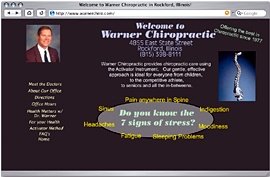
 Style wins the day in the case of Dr. James Warner's site, which relies on a healthy dose of the Macromedia Flash program to deliver its message. Everything from the toolbar (tastefully displayed on the left-hand side of the site) to Dr. Warner's beaming countenance (in the site's upper left-hand corner) uses Flash in one form or another. Fortunately, nearly everyone with a Web browser knows what Flash is (or has at least heard of it), so viewing the site shouldn't be a problem for the average Internet traveler.
There aren't as many sections on warnerchiro.com as on the other ChiroMaster winners, but the information is presented in a clear, straightforward manner, using images when necessary to support the text. Another nifty feature is the site's color scheme; the dark green background is soothing and makes the text easy to read, while each section is associated with a different color, so visitors won't easily forget where they are. The only thing the site is missing is a links page - an oversight we're sure Dr. Warner will remedy in the near future. Regardless, this ranks as one of the best chiropractic websites of 2003.
The Practice Web Site of Dr. John B. Avard (www.dravard.com)
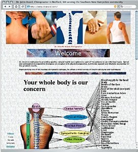
 It may not be the most aesthetically pleasing site in the bunch, but what Dr. Avard's site lacks in style, it makes up for with its vast stores of information. The links section is the most inclusive of any site in the ChiroMaster contest, and its Frequently Asked Questions page answers practically any question a new or returning chiropractic patient may have. The Web site review panel was particularly impressed that Dr. Avard's answers included several scientific references to support his assertions, something most chiropractic sites lack.
Dravard.com also contains several patient-friendly sections. Users can register an appointment in the "Appointments" section; leave a message in Dr. Avard's "Mailbox"; read the chiropractic oath in the "Our Oath" section; and learn about the products and supplies he uses in "Products." Simply put, this is a simple but impressive site that deserves the 2003 ChiroMaster Award.
The Practice Web Site of Dr. Robert Smith (www.drrobertsmith.com)
 Dr. Smith's site won a ChiroMaster in 2002, based on its clean, sharp look; ease of use; fast download time; and patient-friendly features. This year, it receives a ChiroMaster for all of those reasons, and more. For the individual doctor of chiropractic, this site sets a standard all others should hope to achieve.
The nine sections that comprise drrobertsmith.com are expertly designed and displayed. Each section has a nice balance of text, graphics and white space, and in addition to chiropractic, users can get news and information on general health and fitness. The Links page is neither too long nor too short, and the New Patient Forms page offers downloadable copies of forms patients can use before visiting the office. Of all the sites that have been submitted to Dynamic Chiropractic since the ChiroMaster contest began in 1998, this is arguably the best individual chiropractic site on the Web.
Honorable Mention
The Practice Web site of Dr. Channing C. Bolick (www.bolickclinic.com)
Great interactive features, such as rollovers, make this site visually appealing. The site also is updated frequently, and contains a good deal of information on chiropractic and its ability to treat certain conditions.
Macquarie Chiropractic Clinic (www.chiroclinic.com.au)
Dr. Donald McDowall's Web site is well-thought-out and easy-to-navigate, with a tremendous links page and an "Ask the Doctor" section that promises a response within 24 hours. The sound effects associated with certain pages and actions can be a bit distracting, however, and may increase download time for computers with slow Internet connections.
First Choice Chiropractic (www.firstchoicechiropractic.net)
This site utilizes rollovers in its navigation and displays information in a clean, uniform manner. Not every section is complete yet, but the sections that are comprehensive. However, some sections may be difficult to read due to small text size.
The Practice Web Site of Dr. James Edwards (www.jamesedwards.com)
Finally, we would be remiss if we failed to mention jamesedwards.com, the only five-time winner of the ChiroMaster Award, and the only site to win an award every year since the award's inception in 1998. Dr. Edwards' site remains as powerful as ever and is still highly recommended as an important chiropractic resource; however, the fact that it receives honorable mention this year shows that the quality of chiropractic Web sites continues to improve.
Congratulations to all of this year's winners!
Dynamic Chiropractic editorial staff members research, investigate and write articles for the publication on an ongoing basis. To contact the Editorial Department or submit an article of your own for consideration, email
.


